In today’s digital age, responsive images are crucial for creating a seamless user experience on mobile devices. As screen sizes and resolution standards vary widely, optimizing images to become responsive not only enhances visual engagement but also boosts site performance and SEO. In this guide, we’ll cover the best practices for adapting your images for mobile devices, focusing on efficiency and clarity.
Understanding Responsive Images
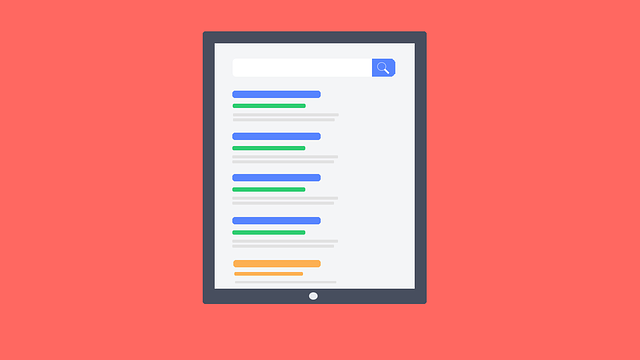
Responsive images are images that work well on a variety of devices and window or screen sizes. They are crucial because they ensure that your website loads quickly and efficiently, regardless of the device. This adaptability not only improves user experience but is also a factor in Google’s SEO ranking algorithms.
Why Optimize Images for Mobile?
There are several key reasons to focus on optimizing images for mobile use:
- Better Performance: Smaller, optimized files load faster, reducing bounce rates and increasing user engagement.
- Improved User Experience: Correctly sized images appear clearer and are more appealing to mobile users.
- SEO Benefits: Google and other search engines prioritize mobile-optimized sites in their rankings.
Optimizing images for mobile is not just about resizing them; it involves several steps that contribute to the overall performance of your website.
Steps to Optimize Images for Mobile
To effectively adapt your images for mobile, follow these key steps:
- Choosing the Right Format: Utilizing formats like JPEG, PNG, and WebP is essential. WebP, for instance, provides high-quality results with smaller file sizes. Converting your image to Webp online free can be an easy and efficient solution.
- Implement SRCSET: HTML5 offers the srcset attribute which allows you to specify multiple image files for different screen sizes, helping browsers to select the most appropriate version.
- Use CSS3 Features: CSS media queries can be used to apply different styles and images based on the device’s properties, such as its width.
For more detailed guidance and tools, visit our blog on responsive web design at https://converterwebp.com/blog.
Tools and Resources for Image Optimization
To simplify the process of creating responsive images, there are various tools and platforms available:
- Google’s WebP is a modern image format that provides superior lossless and lossy compression for images on the web.
- Image compression tools like Adobe Photoshop, or online tools that allow you to convert image to Webp online free.
By carefully selecting your tools and methodically applying best practices, you can ensure that your images are perfectly optimized for mobile viewing.
Conclusion
Optimizing your images for mobile users is not just an enhancement; it’s a necessity in today’s mobile-first world. By following the steps and utilizing the tools mentioned above, you can ensure that your images are responsive and contribute positively to your site’s overall performance and SEO. Remember, in the realm of digital marketing, a well-optimized image can significantly impact user engagement and search engine rankings.
Ready to enhance your website’s visuals for mobile devices? Start by converting your existing images to a more efficient format like WebP and see the difference in performance and user experience!